There is a lot to packaging these days: sustainability, technology, food safety, virus protection and shelf life. But the traditional, time-tested attribute of eye-appeal is as crucial as ever when consumers are perusing the meat case or scrolling through e-commerce sites.
Global packaging design firm Bizongo, based in Mumbai, India, conducted a survey on packaging and consumer buying behavior this year and found that 63% of consumers have purchased a household product because it looked appealing. And a strong majority – 70% – agree that graphics, color and shape are the most important parts of package design.
Other studies confirm that people do judge products by their looks, in addition to weighing other factors. According to a survey from Lakewood, NJ-based Luminer, 53% of shoppers say that bright colors draw their attention to a product while one-third (33%) report that they tend to reject a product if they don’t like the label.
According to new research conducted for Shorr Packaging Corp. of Aurora, Ill., 34% of consumers rated the importance of food packaging and food labels in their buying decisions a 10 out of 10. Nearly 70% of respondents in that survey chose an importance rating of seven or higher out of 10.
It can be quite the balancing act to provide the right amount and type of graphics with the information and other package features that consumers seek. In its report on 2020 food packaging trends, for example, Bizongo cited attributes including minimal design and emotional engagement, along with personalization, sustainability and transparent labeling.
In addition to graphics, which include color photography, illustrations and text, package design encompasses the way the product itself is showcased. For portioned products like steaks, chicken breasts and fish fillets, clear, airtight films allow for a billboard effect while also keeping product fresh. Other forms, such as stand-up pouches and flat bottom bags, also make a branded product pop more when shoppers are browsing or scrolling.
The eyes have it

In response to consumer preferences and the ongoing quest to make products stand out on shelf or on screen, meat and poultry companies that offer branded products are working toward the balance of aesthetic appeal and desired functionality. Munster, Ind.-based Land O’Frost Inc. had eye appeal top of mind when redesigning packaging for its flagship premium deli meat line earlier this year.
“We wanted to keep Land O’Frost’s loyal users while attracting new audiences with a brand story relevant to them. Our research told us the brand had room to improve in appetite appeal and quality cues. What better way to do that than with a big, delicious sandwich front and center that inspires meal making at home?” said Shanta McGahey, director, insights and integrated brand communications.
To be sure they were on the right track, the brand sought feedback from consumers who would be eyeing their products at retail.
“We shared the new design with grocery customers first and received wonderful feedback regarding the clean, easy-to-read, modernized design. The new packaging hit shelves in August and through our social media, we’ve received positive comments from consumers as well about how modern and delicious it looks,” McGahey said.
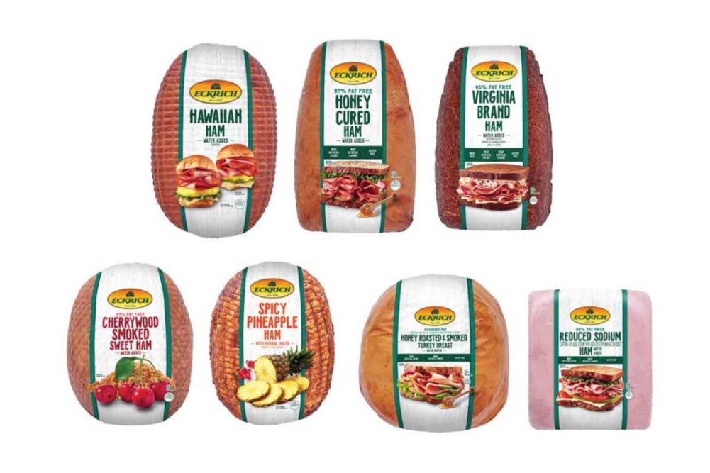
Eckrich from Smithfield Foods, Smithfield, Va., is another deli meat brand that has tapped into consumer insights for a recent redesign. Packages now feature a white background with strong photography and visual cues that list product information in a streamlined way.
“We hope to inspire consumers with new and different ways to use deli meat in their everyday lives, while also better communicating the product benefits and the quality that they have come to know and trust from Eckrich,” said Laura Koenes, Eckrich brand manager.

Over in the fresh meat case, premium meat and poultry products are also designed to attract attention. Pre Brands is a Chicago company that has distinguished its products with vibrant packaging designed to signal its brand identity at the point of sale, amid other branded items and commodity meats. That was true for its original grass-fed and grass-finished ground beef and steak products sold in bright green packaging, and it’s true for its latest premium pre-frenched lamb rack. The lamb is sold in an airtight, transparent, vacuum-sealed plastic that is free of nitrates and BPA, with on-package consumer tips and recipes.
“Pre’s patented packaging is designed for vertical merchandising, which provides eye-catching billboards in the meat section of the grocery store,” said Nicole Schumacher, chief marketing officer of Pre Brands. “The transparent film provides a 360-degree view of meat as well as offers a more natural way to combat spoilage by vacuum-sealing our products so that all the oxygen is removed. This will keep the beef and lamb fresher, longer and allow for longer shelf life without adding chemicals. The easy-peel makes opening the meat easy and keeps your hands and kitchen clean without the use of scissors or knives.”
The 2020 effect
Finally, like almost everything else in life and business, the global coronavirus outbreak has impacted package design, elevating the importance of visual appeal. Shorr Packaging’s recent study found that during the pandemic, 47% of respondents purchased products from brands they were previously unfamiliar with due to the product’s packaging, and 88% of those say they plan on purchasing that item again in the future.
McGahey agrees that packaging is arguably more important than ever.
“Because of the pandemic, eating at home and grocery shopping continue to outpace restaurant food expenditures in growth. As a result, online grocery shopping is the new norm, up 124% in September versus a year ago. This has two implications for a brand’s visual appeal,” McGahey explained. “First, digital shelf presence is now as important as in-store. Online, brands need to clearly communicate the attributes that people use to choose their fresh grocery product – like brand and flavor – on a much smaller billboard than the store shelf. This is where a clear communication hierarchy is a must. Second, brands need to provide meal inspiration to consumers who are seeking variety after spending so much more time at home.”